SmartQA Community

3 failures of poor system operationalisation

Summary
Successful large system deployment failures is not merely due to poor testing of software. It is about poor operationalisation of software. This article outlines three major failures – Poor transition of software to end users, messed up business procedures and Data issues, the result of poor operationalisation. These have been curated from two articles.


FAIL #1 Avon : Poor transition of software to end users

In 2013 Avon’s $125 million SAP enterprise resource planning project failed after four years of work, development and employee testing.

ERP software can brag all it wants about functionality and all of the magical modules and apps you can use to make your business processes easier, but that won’t mean anything if your software isn’t actually usable. It’s all about aligning your software to your business processes, and if you can’t get staff to use your ERP, they won’t be carrying out the processes necessary to keep your business running. Make sure your employees are properly trained and transitioned into the new software, and that they want to use that system in the first place.

Read about this in detail at https://blog.datixinc.com/blog/erp-failure-stories

FAIL #2 Woolworth : Business procedures messed up

The Australian outpost of the venerable department store chain, affectionately known as “Woolies,” also ran into data-related problems as it transitioned from a system built 30 years ago in-house to SAP. 

The day-to-day business procedures weren’t properly documented, and as senior staff left the company over the too-long six-year transition process, all that institutional knowledge was lost — and wasn’t able to be baked into the new rollout.

Read about this in detail at https://www.cio.com/article/2429865/enterprise-resource-planning-10-famous-erp-disasters-dustups-and-disappointments.html

FAIL #3 Target Canada : Data issues

Many companies rolling out ERP systems hit snags when it comes to importing data from legacy systems into their shiny new infrastructure. The company’s supply chain collapsed, and investigators quickly tracked the fault down to this supposedly fresh data, which was riddled with errors -items were tagged with incorrect dimensions, prices, manufacturers, you name it.

Thousands of entries were put into the system by hand by entry-level employees with no experience to help them recognise when they had been given incorrect information from manufacturers, working on crushingly tight deadlines. It was later found that only about 30 percent of the data in the system was actually correct.

Read about this in detail at https://www.cio.com/article/2429865/enterprise-resource-planning-10-famous-erp-disasters-dustups-and-disappointments.html


About SmartQA The theme of SmartQA is to explore various dimensions of smartness to leapfrog into the new age of software development, to accomplish more with less by exploiting our intellect along with technology.  Towards this, we will strive to showcase interesting thoughts, expert industry views through high-quality content as articles, posters, videos, surveys outlined as a SmartQA Digest weekly emailer. SmartBites is “soundbites from smart people”. Ideas, thoughts and views to inspire you to think differently.


#25: “The Silver Edition”

SmartQA Digest

Thank you for your patronage. This is our Silver edition, yes the 25th ! Welcome to a special XXV SmartQA Digest!
I have made a lovely eBook for you and a special SmartBites video.
May the poster fill you with bliss.

SmartBites

||VIEWS FROM INDUSTRY LEADERS||

24 – “Great quality is about “operationalising”, beyond testing”

SmartQA Digest

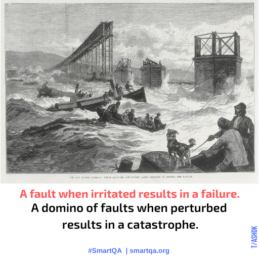
Welcome to SmartQA Digest, that outlines aspects of successful large scale application deployment. Zulfikar outlines how a mindset to ‘system operationalisation’ is key delivering large IT systems successfully. The article outlines three failures of poor operationalisation. Would you agree that a massive failure is really the domino effect of small faults? Enjoy the poster!

SmartBites

||VIEWS FROM INDUSTRY LEADERS||

#23 – “10 Thoughts & Creative Thinking”

SmartQA Digest

Welcome to SmartQA Digest that features thoughts from TEN practitioners from around the world as SmartBites, an article on “Right brained thinking” and a lovely poster on craftsmanship. After all “Craftsmanship is where head touches the heart”.
Have a great day and a lovely weekend. 

SmartBites

||VIEWS FROM INDUSTRY LEADERS||

#22 – “Leapfrogging #2”

SmartQA Digest

Welcome to second-part of the special edition of SmartQA Digest on ‘Leapfrogging’. Tathagat talks about “Systematic Inventive Thinking” & “Network Leadership” in SmartBites. The featured article looks at testing as a left brain activity and the poster resonates with this. Next week we will shift sides to the right brain!

problem solving skills in software testing poster

SmartBites

||VIEWS FROM INDUSTRY LEADERS||

#21 – “Leapfrogging #1”

SmartQA Digest

Welcome to a two-part special edition of SmartQA Digest on ‘Leapfrogging‘. The SmartBites by Tathagat features an interesting idea “The Super Organism Mindset”. The featured article looks at what it takes to express well to do high performance QA. Enjoy the poster of “Go beyond”, to leapfrog! Thank you for reading, please do forward to anyone who you think values brilliant quality.

SmartBites

||VIEWS FROM INDUSTRY LEADERS||

#20 : “Skilling for future”

SmartQA Digest

Welcome to a Special Edition of SmartQA Digest on ‘SKILLS’. The SmartBites has the wisdom of Desikan, Raja and Anuj on “Skilling for future”. The featured article takes an interesting look at the role of language to high performance QA. Enjoy the poster inspired by reaching out to the stars. Thank you for reading, please do forward to anyone who you think values brilliant quality.

SmartBites

||VIEWS FROM INDUSTRY LEADERS||

#19 : “The winds of change”

SmartQA Digest

Welcome to a Special Edition of SmartQA Digest on ‘CHANGE’. The SmartBites has the wisdom of Jawahar, Sudhir & Vivek on changing to the new age of QA. The featured article takes an interesting look at the role of language to high performance QA. Enjoy the poster inspired by falling leaves of autumn.Thank you for reading, please do forward to anyone who you think values brilliant quality. 

SmartBites

||VIEWS FROM INDUSTRY LEADERS||

Role of Abilities, Checklists & Tests for Accessibility

Curated by T Ashok @ash_thiru

Summary
Evaluating accessibility by using only able-bodied people(testers) or by enabling accessibility only via use of checklists are not useful. The simplest tests to ensure a complex application is well covered via ‘only testing using the keyboard’, ‘relying on the spoken word to navigate’, ‘using high contrast mode of display’ & ‘disabling certain options in the browser’ (for web apps). This article is curated from four interesting articles.


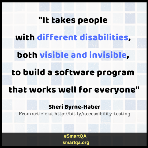
Valid experience is vastly more important than mere simulations. Accessibility testing really isn’t so different than surgery in this regard. You want a team chock full of people who are “native users of assistive technology” (which is the nice way of saying “disabled”), and not people simulating disabilities.

says Sheri Byrne-Haber in her interesting article “Make People with Disabilities Part of your Accessibility Testing Program”.

Why would that be? Here are some of the key reasons:
Running an accessibility testing program without people with disabilities is disrespectful “..at the end of the work day, those non-disabled testers get to go back home to their abled lives. They do not experience the day-in, day-out 24×7 frustration of someone with a disability slamming head first into either digital or physical barriers every single day.”
Running an accessibility testing program without people with disabilities is neither inclusive nor diverse “…no one can legitimately claim that testing with completely able bodied testers will give you the equivalent experience of a population of people with varying degrees of disability.”
Running an accessibility testing program without people with disabilities is neither inclusive nor diverse “…not considering or using people with disabilities in your accessibility testing program is deliberate and discriminatory exclusion, the opposite of being diverse and inclusive. ”

Do read the full article here (5 min read)

In the article  “Accessibility Checklists — Just say No”,  Sheri Byrne-Haber says in the long run, general accessibility checklists do far more harm than good in establishing a good accessibility program as:

  • Checklists are part of a reactive, not proactive accessibility practice
  • Checklists are a black and white solution in a sea of gray
  • Checklists do not motivate people to think neutrally or positively about people with disabilities
  • Checklists are a crutch
  • Checklists put blinders on users
  • Checklist items open to interpretation create more problems than they solve
  • Checklists don’t lead to an inclusive culture

“Design for accessibility, train everyone who touches the content and infrastructure, and include people with disabilities in every step of the path including research and testing” is what the author concludes at the end of the article.

In the article “Three tests for accessibility“, Jonathan asks the question “given that there are so many criteria for good accessibility, and that the application itself may be complex in many ways, how do we verify that all parts of the application are accessible?” and outlines three simple tests to accomplish this:

  1. Screen-reader-only test : Try to use the application, relying only on hearing the spoken word.
  2. Keyboard-only test : Try to use the application, relying only on keyboard input. Put the mouse away or disconnect it, or disable your trackpad.
  3. Automated test: Run an automated testing tool on your application, analyse the output and address all major errors detected.

The 6-min read of this article is time well spent.

Continuing on this same train of thought is another interesting article by Karl Groves that outlines the six simplest web accessibility tests. The author outlines these as :

  1. Unplug your mouse and/ or turn off your trackpad- Interact with the site using only the keyboard. 
  2. Turn on high contrast mode- Colors on the site are essentially removed entirely.
  3. Turn off images – Images shouldn’t be required to understand the page and shouldn’t be relied upon for important UI controls
  4. Check for captions or transcripts- If you have media on your site, check for captions, transcripts, and other possible alternatives
  5. Click on field labels- Issues with forms tend to fall into three main categories: Missing or incomplete labelling, ineffective error handling, and poor focus control.
  6. Turn off CSS – Presentational methods cannot be overridden by users who’ve created custom style sheets.

Read the full article The 6 Simplest Web Accessibility Tests Anyone Can Do

Click here to read a summary of six interesting articles in accessibility..


About SmartQA The theme of SmartQA is to explore various dimensions of smartness to leapfrog into the new age of software development, to accomplish more with less by exploiting our intellect along with technology.  Towards this, we will strive to showcase interesting thoughts, expert industry views through high-quality content as articles, posters, videos, surveys outlined as a SmartQA Digest weekly emailer. SmartBites is “soundbites from smart people”. Ideas, thoughts and views to inspire you to think differently.


#18 – “Accessibility #2”

SmartQA Digest

Welcome to another edition of SmartQA Digest, the Second of TWO part theme on “Accessibility”. Listen to Anuradha Biswas’s video on “the HOW of accessibility”. The featured article is also on “HOW to validate accessibility”. 

 
We have enhanced the SmartQA Digest with brilliant galleries of all the SmartBites, Posters, Articles. See the NEW “smartbits” gallery. Check these out at the end of SmartQA Digest page.
Role of Abilities, Checklists & Tests for Accessibility article

Role of Abilities, Checklists & Tests for Accessibility

Evaluating accessibility by using only able-bodied people(testers) or by enabling accessibility only via use of checklists are not useful. The simplest tests to ensure a complex application is well covered via ‘only testing using the keyboard’, ‘relying on the spoken word to navigate’, ‘using high contrast mode of display’ & ‘disabling certain options in the browser’ (for web apps). This article is the curated from four interesting articles.

Read More »

SmartBites

||VIEWS FROM INDUSTRY LEADERS||